VERA Brand Identity
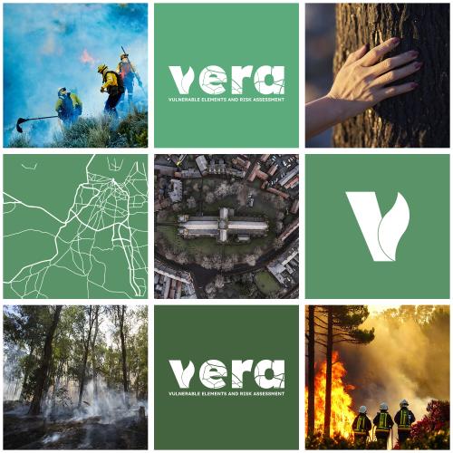
VERA's brand identity was developed by VOST Portugal and, after collecting feedback from all consortium partners, it was approved.

February 12th 2024
The branding and visual identity of the VERA project are very important for creating a recognizable and authoritative presence among stakeholders, partners, and the general public. This section expands on the development and application of the project's logo and brand identity, ensuring consistency across all communication channels.
VOST Portugal worked to create a logo that encapsulates the mission and essence of VERA. The project's dedication to environmental risk analysis, particularly in assessing vulnerabilities to forest fires, is at the heart of our design.
Logo Design Overview
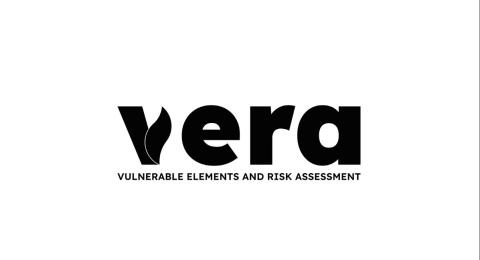
The logo is anchored by the stylized representation of the name 'VERA', with each letter incorporating a map-like design, symbolizing the project's focus on geographic information systems and spatial analysis. This mapping pattern is integral to the logo's concept, reflecting our aim to provide a comprehensive and detailed assessment of risk areas.
Symbolism
The most prominent feature of the logo is the letter 'V', which is strategically bifurcated. On the left, angular segments represent the analytical and data-driven aspect of VERA, suggesting a systematic dissection of data for insight. On the right, the letter morphs into a flame-like shape, a direct nod to the project's focus mainly on forest fires. This duality speaks to the project's multifaceted approach: data-driven yet responsive to the dynamic nature of environmental hazards.
Color Scheme
The color version of the 'V' uses a gradient transitioning from blue to green to red. The blue shades symbolize inspiration and stability. The green shades stand for environmental protection and sustainability, underlining the project's preventative and protective goals. The red tip indicates the imminent risk and urgency of our work in mitigating fire hazards. The colors also hint at the countries where VERA’s consortium partners come from.
Proposed Color Palette
Our proposed palette features a spectrum of greens transitioning to a poignant red, with the introduction of the yellow and blue, to represent the countries of the consortium (Spain and France, with Portugal being represented by the green color) The greens range from a deep forest hue (Hex: #43633F) to a lighter olive (Hex: #5A9367), ending in a rich fern green (Hex: #5CAB7D). This progression mirrors the project's growth from data analysis to action. The red (Hex: #D64045) symbolizes the acute awareness of multi-risk that VERA aims to communicate and manage.
We believe this logo bridges the gap between analytical precision and the organic unpredictability of multi-hazards. It is a visual commitment to the VERA project's core objectives: to analyse, comprehend, and effectively communicate the risks associated with environmental vulnerabilities.

Vulnerable Elements and Risk Assessment.
Sectors
Risk drivers
Thematic series